

PROJECT


- Nishimura & Asahi (Gaikokuho Kyodo Jigyo)
- Image Revolution
Japan's Largest Law Firm undergoing a Transformation with a New Visual Identity
Nishimura & Asahi is the largest law firm in Japan, with more than 800 professionals (*) and 1,000 staff members in 20 offices around the world. N&A’s mission is “to create a prosperous and just society based on the rule of law. With this as its basic mission, the firm is an international law firm that provides the highest level of legal services on a global scale.
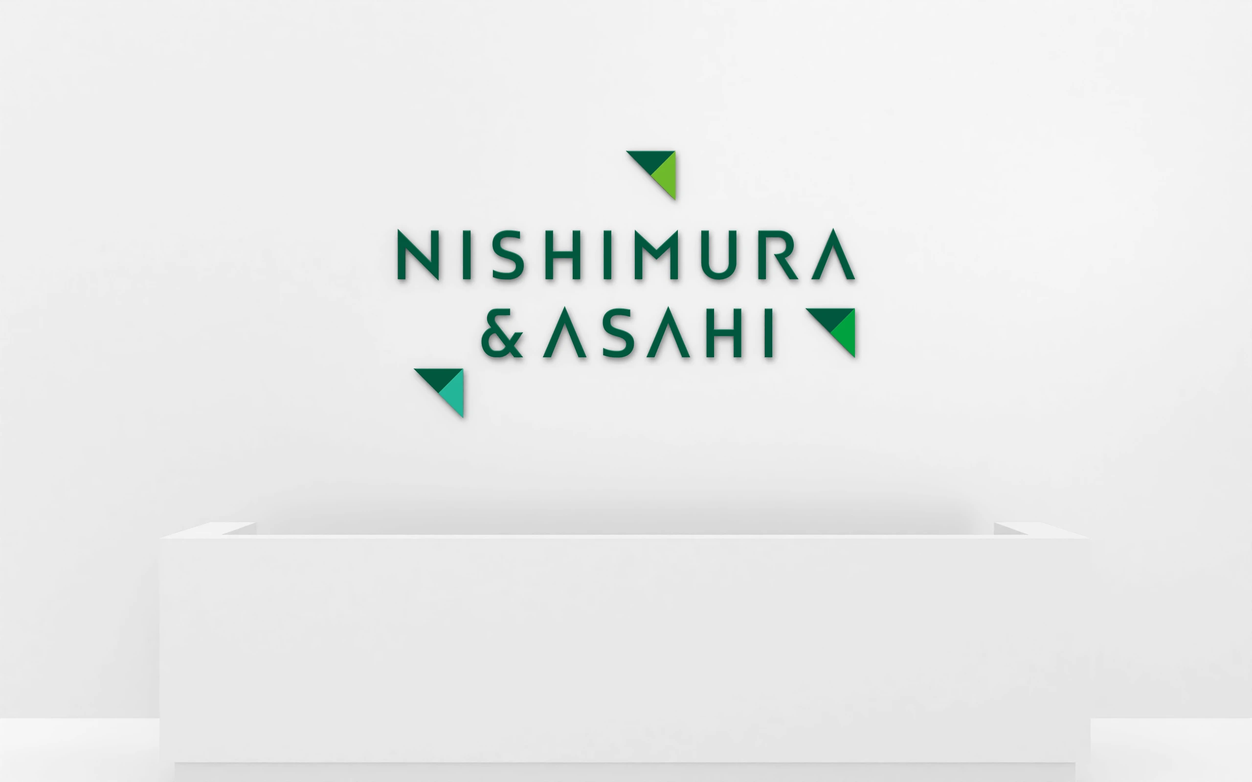
In recent years, the legal industry has come to require not only traditional legal advice centered on Japanese law, but also comprehensive solutions that go beyond legal affairs for businesses that are expanding globally. In addition, there is a need for creativity in guiding clients with unconventional ideas that are not bound by precedent. As a frontrunner in the Japanese legal industry, Nishimura & Asahi has always aspired to be a pioneer in the frontiers of the legal industry under its promise “Leading You Forward. In order to embody such will as an organization more straightforwardly, we decided to revamp our brand. For this momentous occasion, BRAVIS took charge of the concept development, logo development, design manual development, photographic rule development, and motion logo development.
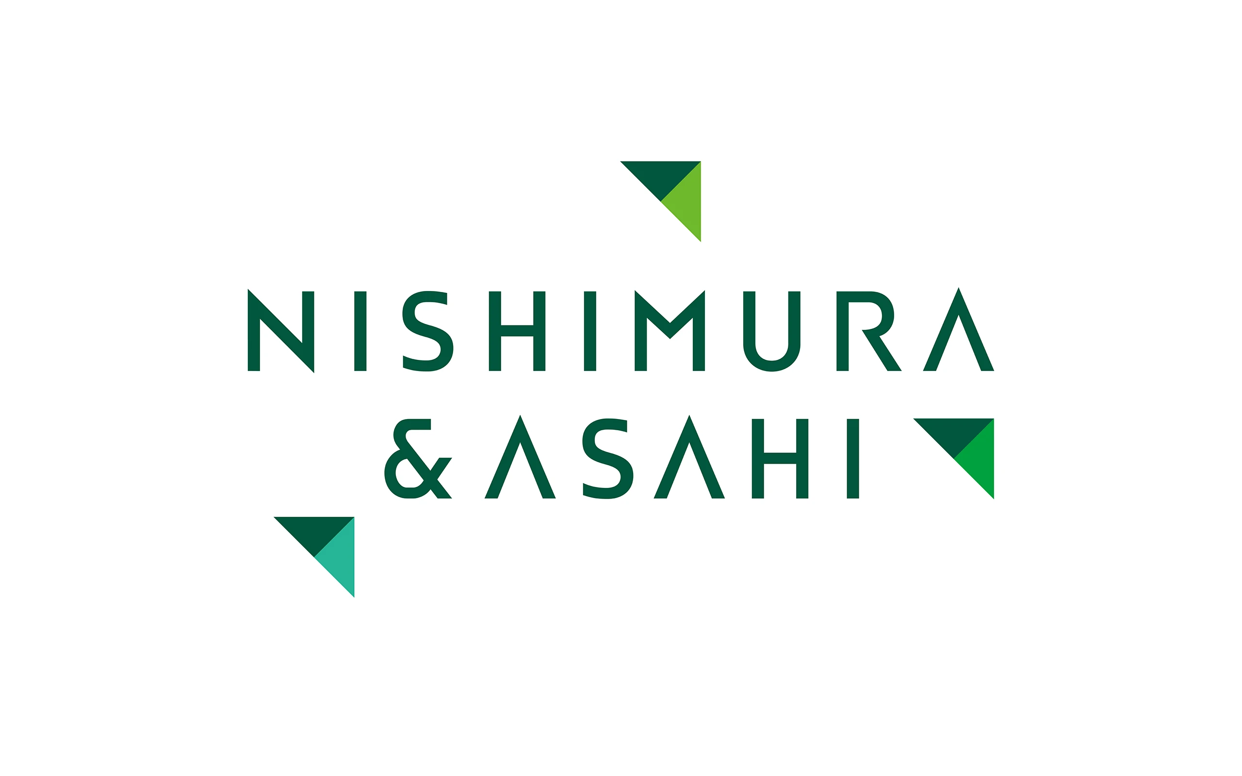
The new logo is a sharp and sophistcated design that expresses the image of Nishimura & Asahi as a pioneer in the industry and society with innovative solutions. Particularly striking are the three triangles, each with an ascending right shoulder, named “Nishimura Arrow. The “Nishimura Arrow,” which looks like a paper airplane taking off into the sky, expresses the identity of Nishimura & Asahi as a pioneering law firm in the industry that started in Japan.
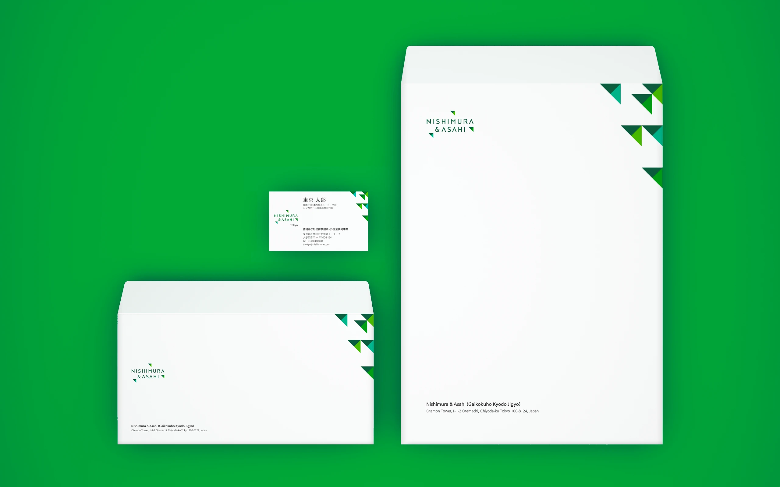
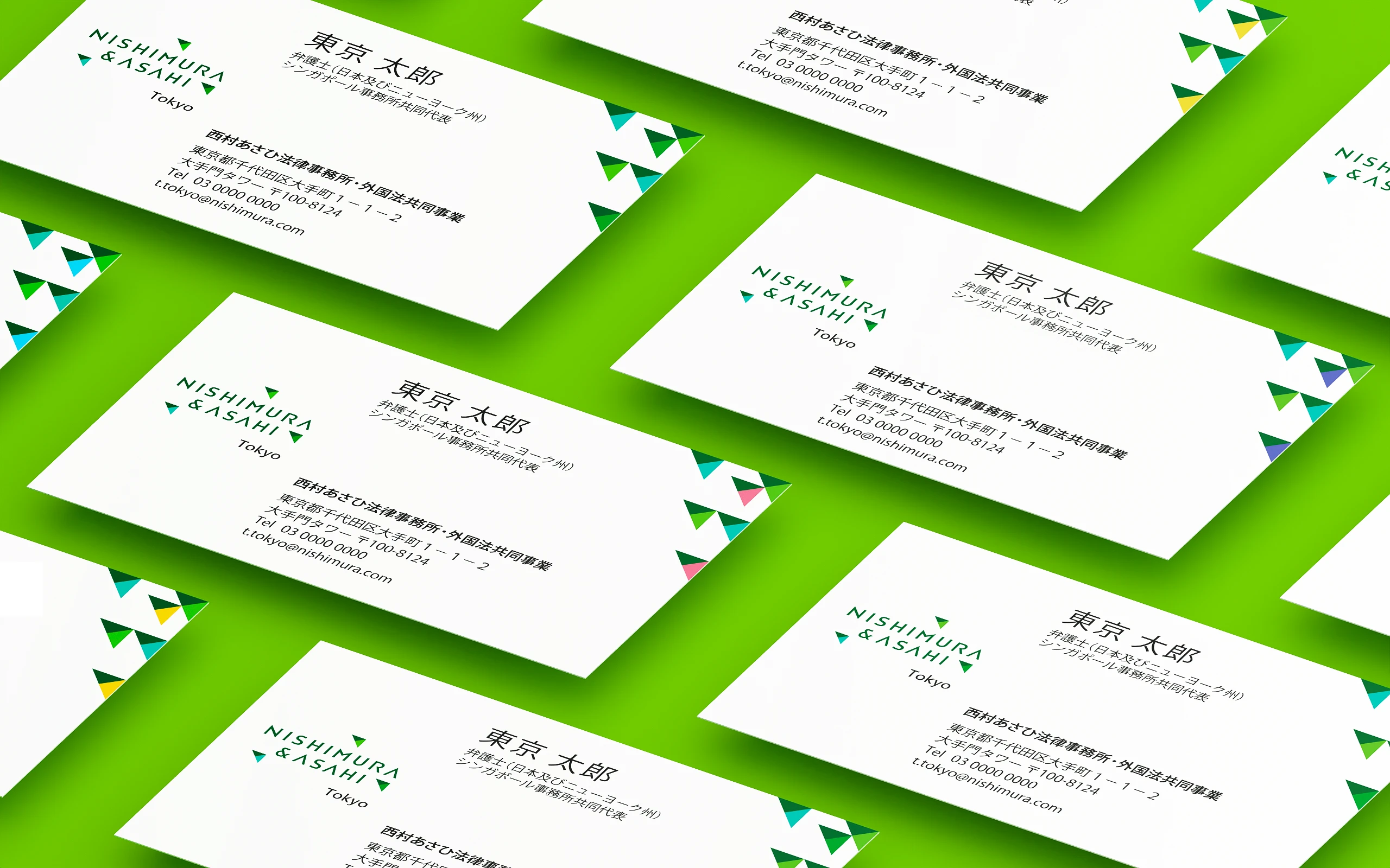
It also represents the three strengths of Nishimura & Asahi: “Solutions,” “Commitment,” and “Spirit,” which are a balance of diverse elements such as “tradition and forward-thinking spirit,” “individual ability and overwhelming organizational strength,” and “global sensibility and Japanese identity. Solutions, Commitment, and Spirit. The “Nishimura Arrow” is also used as a sub-graphic on business cards, websites, news releases, etc., and is not the end of the design process. The logo is based on the green color that is the identity of Nishimura & Asahi, and the colors are more luminous than before, combining dignity and brightness. The logo is now both powerful and sophisticated, befitting a leader in the legal industry.
In addition, BRAVIS developed a motion logo. The “Nishimura Arrow” used in the logo has been added to the motion picture, flying steadily upward to give a more intuitive sense of the concept behind the logo. The motion logo is used in a concept movie to convey the brand renewal and to expand Nishimura & Asahi’s brand identity.
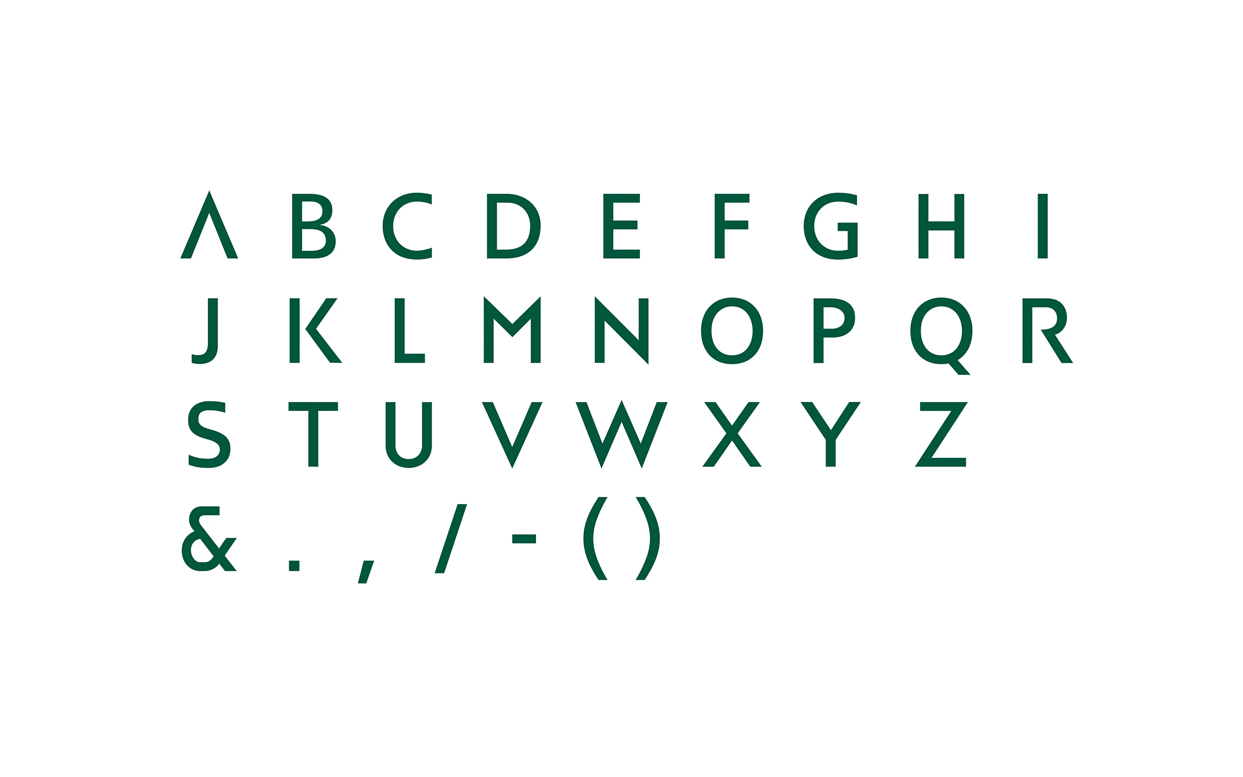
We also developed a design manual (Japanese and English versions) that outlines the rules for using the logo, a tone of visuals that defines the photographic expression of Nishimura & Asahi, and “Nishimura Gothic,” an original font used to display the names of each of the company’s locations. We have created a system that provides visual consistency at all times.
* Including some affiliated and alliance offices
- CLIENT
- Nishimura & Asahi (Gaikokuho Kyodo Jigyo)
- SERVICE
- Application Design
- Design System
- Group Identity
- Motion Graphics
- Original Font
- Tone & Manners
- COUNTRY
- Japan
